Iona's AS Media Blog
Sunday, 10 April 2011
Tuesday, 8 March 2011
Monday, 29 November 2010
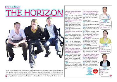
Analysis of my music magazine double page spread
- Target audience - My target audience for my music magazine is young teenage girls.
- House Style - Because I have decided to create a pop magazine which are usually aimed at girls I have decided on 3 main colours which are: Pink, Blue and Purple, also using black for some text.
- I have also used 3 columns for my article which is also the amount of columns I have used for my contents page. - Layout - I think the layout of my double page spread is well set out and I have clear outlines of where I need to place my pictures.
- I think the way I have set out my question and answer section of the article is well set, because I have researched other pop magazines and used them as guidelines. I decided to have my introduction go across all three columns because then it will catch the readers attention right from the start. I have also used the house style colours when writing my article because I have used one colour for the questions another colour for the answers and another for the names of the band members.
- I do not like the way the advertisement for the band has turned out because there is too much white space around it, so I need to look at that part of my article and see how to improve it.
- I also dont like the black line around the box for my article or profile information boxes, I thought it would look effective and stand out but with some of the boxes the lines over lap. - Profile - Once again I have used my house style colours for the information boxes. I need to complete the boxes by filling in the information, this will then help me see if I could add more into the boxes or maybe have to take things out because there might be too much space left or not enough. I also need to edit and add my profile pictures into the correct spaces at the left side of their own information box.
Saturday, 13 November 2010
Subscribe to:
Comments (Atom)


